
Together with graphic designer Georg Eisl from the K12 agency in Bad Ischl, we spent a good year fine-tuning the designs until we were satisfied with the result. It was important to us that the new design
– on the one hand a high recognition value
– and on the other hand to express the close connection between the two winery lines.
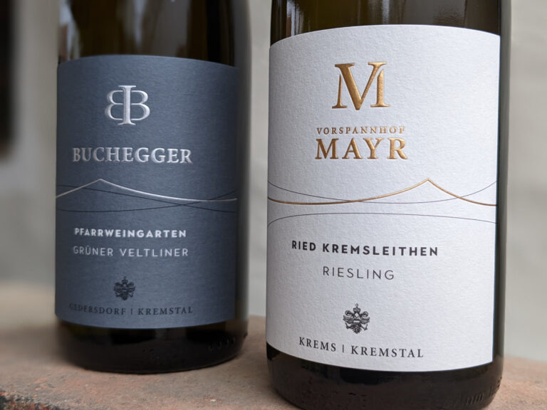
We believe that we have succeeded in this balancing act. After we had to work a bit more on the logo of Vorspannhof Mayr when adapting the two logos, we paid a bit more attention to the one of Weingut Buchegger when relaunching the labels. This now also has lines that stylize the wine hills of our vineyards. Both the colors (Buchegger: anthracite with silver embossing, Mayr: natural colors with gold imprint) and the very high-quality paper are intended to emphasize the quality of our wines. Detailed information and the vintage will be available on a back label from now on.
An exciting project is coming to an end, and at the same time a new era is beginning for us. We hope you like the new labels as much as we do.